Time for a New Design
The two founders of the Recipe Revolution reached out to us in early Spring with a problem: they had sales skills, app development skills, partnerships & a fully functional app, but an (in their words) ‘amateurish’ design, which was made by their lead engineer. They knew that in the current App Store, not only does your app need to be unique, fast, & error-free, but it also needed a great design & branding for it to compete against the competition. After a few meetings and a rough, sketched UX that we had in mind, the founders decided to work with us.

This time it’s personal
The Recipe Revolution app has a simple, yet challenging goal = How to convert any recipe into a Gluten-Free version? One of their founders grew up with the Celiac disease, which forces him to completely avoid gluten. This makes eating out difficult, but even making simple dishes at home (especially those recommended by friends) a huge burden. So, after speaking with various food scientists (and bringing one into the company), he realized that creating a conversion through an algorithm is possible. After a few prototypes, the RR team made a prototype & launched on the App Store.

The app functioned by allowing the seller to upload their seat information: section, row, seat #, price, and the location of where they wanted to transfer tickets. This was decided to be at either the stadium or the location of the seller’s choosing. If a buyer purchased that seller’s tickets, they’d go into an “Uber” type meetup process where they could text or call to meet up and transfer tickets. The transaction was handled safely in the app, and there was even a verification process in the dashboard that required users to upload the barcode of the ticket, ensuring that the tickets were valid.
So Fresh, So Clean.
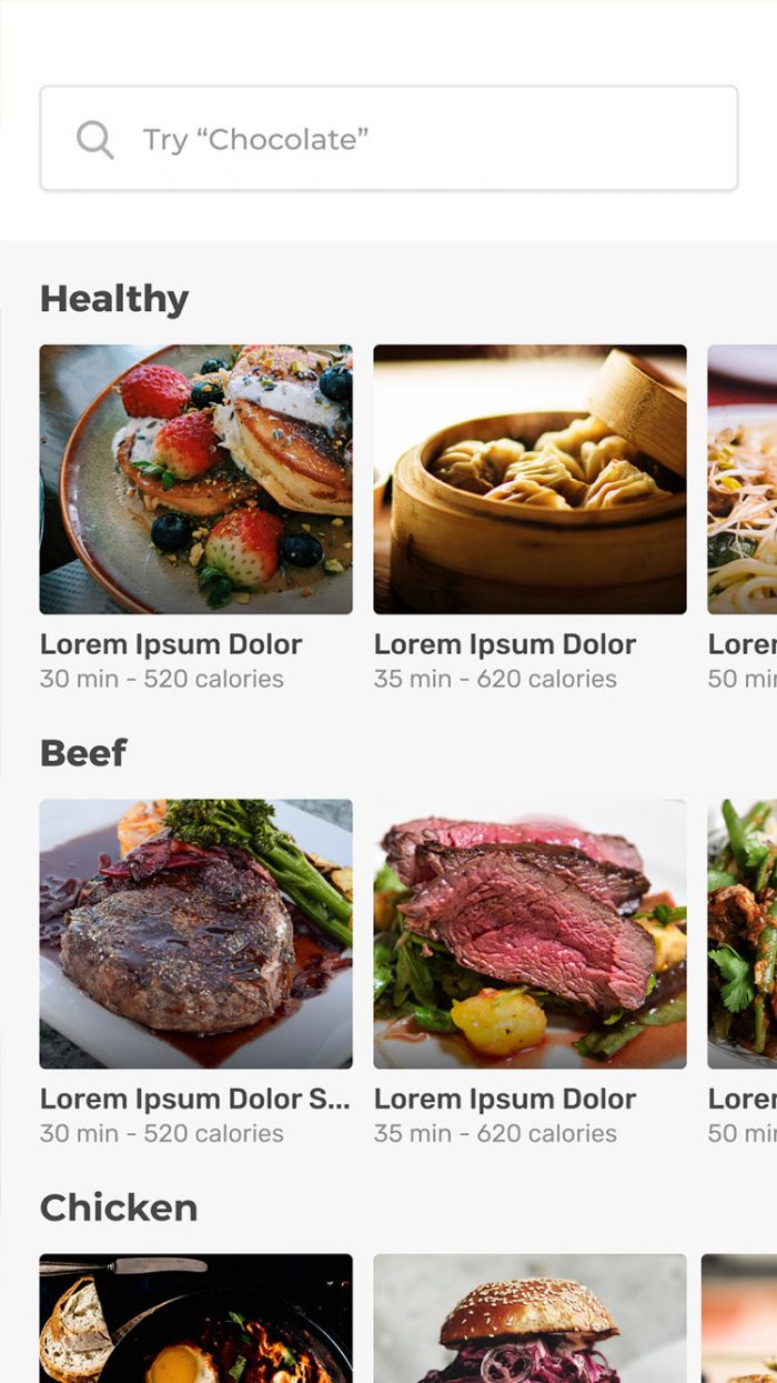
However, app users weren’t using it. The prototype served it’s the main purpose (to learn from early customers), but the design – both the User Experience & User Interface was holding it back from its full potential. So, we went through extensive product development, UX, & UI sprint with the founders & came up with an incredibly clean & vibrant design with a heavy emphasis on imagery.
