How to stand out?
Midwest.VC was started with a simple purpose, to invest in amazing startups located in the Midwest that are routinely get passed over for ‘lack of traction’. Midwest.VC (or MVC for short) fills a critical void that’s in the Midwest, seed & pre-seed funding so startups have enough money to get to the next level.
Sadly, this is a reason that many promising startups in the Midwest have to shut down or get supplanted by ‘better funded’ startups, even if they had a better team, more product-market-fit, or potential than startups on the East & West Coast.
So, the founders of MVC saw a huge opportunity & decided it was something they could dedicate their time & energy to for the next 10+ years.

Which direction to go?
While the team had plenty of experience in building, operating, scaling & exiting startups, they were relatively newcomers to the investing world. They didn’t have a huge personal exit, didn’t come from VC, and didn’t have a ‘family fund’. They did have an incredible network & the incredible experience necessary to start a successful startup, something which is sadly missing from the early-stage investment world in Chicago & the Midwest.
Further, the team didn’t have any massive success via their own angel investments, since it’s too early for many of their investments to exit. So how could they stand out?

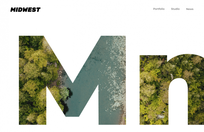
The team meet with LVL & came up with a few different design directions, one of which is above. While they loved this design (and the others) & thought it could’ve been a great fit, it also seemed ‘too clean’ & too much like other sites that we studied. We wanted to create a brand that better reflected the team & what they look for in startups.
We ended up with a grittier & tougher aesthetic that they loved. They concluded that their favorite startups are those that hustle & get shit done, no matter the odds – something we think was better reflected in the dark mood with somewhat of a ‘grungy’ vibe through the typeface. They’re very happy & are super pumped with how it turned out!
